What is flexbox?
Flexbox is a property that you can use in CSS that will position any child elements in accordance with a few simple rules. What does this mean? Well instead of spending a lot of time positioning elements with margins, position absolute and float you can just tell flexbox how you want all the elements to be displayed and let it take care of the hard work for you.
How does it work?
Flexbox Axis
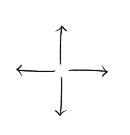
Flexbox aligns the item in the flex container on either the main or the cross axis. Think of these as lines going from the top to bottom of the page and from left to right. The direction in flexbox can also be set to either row or column. If the direction is row then the main axis runs from the left to right of the page and the cross axis runs from top to bottom. If the direction is set to column then its the other way round: the main axis runs from top to bottom and the cross axis runs from side to side. Don't worry if this all sounds very confusing, as you start playing around with flexbox it will be easy to figure out.
Display
The first thing you need to do is give your parent element a display property of flex
.example {
    display: flex
}
or for an inline element display: inline-flex
Flex direction
You can now specify a flex direction. This has to do with, you guessed it, the direction your elements line up. Let's create some numbered <div>s.
<section class="flexbox">
  <div>
    <p>One</p>
  </div>
  <div>
    <p>Two</p>
  </div>
  <div>
    <p>Three</p>
  </div>
  <div>
    <p>Four</p>
  </div>
</section>
.flexbox div {
  background-color: blue;
  color: white;
  margin: 2px;
  width: 100px;
  height: 100px;
}

.flexbox {
  display: flex;
}
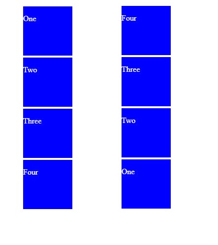
The default for flexbox is flex-direction:row. You can set this explicitly or leave it as default.

Set flex direction to row reverse and you will see the order of the <div>s reversed

The other two direction properties are flex-direction: column; and flex-direction: column-reverse;. As the name suggests this will order the contents of the container into a column in normal or reverse order.
Flex Wrap
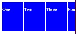
The Flex Wrap property defines what should happen when the size of the container is reduced so that the children no longer fit in it. When you have flex-wrap: nowrap; the items will not drop onto the next line if they run out of space, instead, they will first reduce their width and then stop being visible in the viewport.
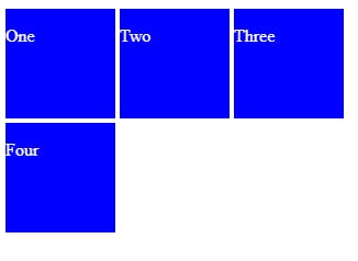
flex-wrap: wrap; on the other hand simply pushes the children onto the next line.
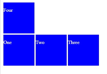
And flex-wrap: wrap-reverse; will do the same thing but populate the bottom line first
Justify content
Here's where flexbox comes into its own. Instead of spending hours with CSS positions only to add an extra element and find that it no longer works, with justify content you can position elements in relation to each other with just one property. Let's have another look at our <div>s to see how it works
justify-content: flex-start;

justify-content: flex-end;

justify-content: center;

justify-content: space-around;

justify-content: space-between;

justify-content: space-evenly;

Align Items
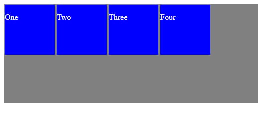
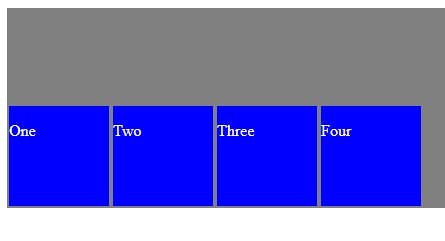
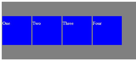
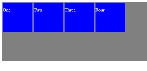
This property determine how items should be displayed on the cross axis. To illustrate this I've made the wrapping div container grey.
align-items: flex-start; Keeps the items aligned to the top of the container
align-items: flex-end; will align the items to the bottom of the container
align-items: center; will center the items horizontally. This is super useful as it's not always easy to do with regular CSS
align-items: baseline; takes the first element in each flex item, and lines things up by the bottom of that element.
align-items: stretch; will stretch the items from the top to the bottom of the container as long as the height property is not set on the items
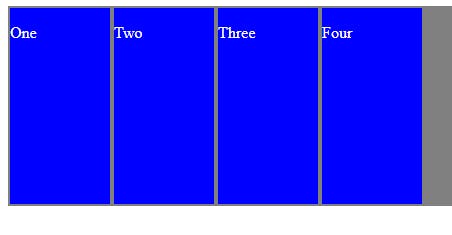
Align Content
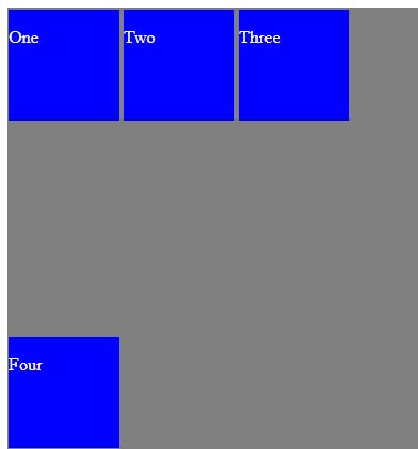
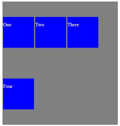
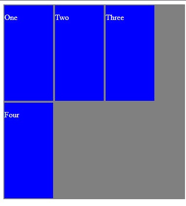
The align content property deals with how the items display when on multiple lines. For this reason, it will only take effect if the flexwrap property is set to wrap and the content is displayed over more than one line.
align-content: flex-start;
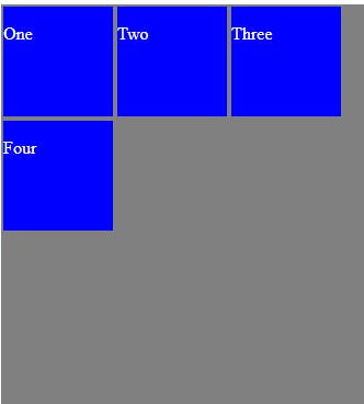
align-content: flex-end;
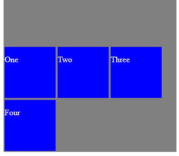
align-content: center;
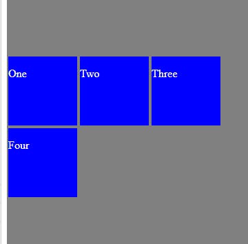
align-content: space-between;
align-content: space-around;
align-content: stretch;
Flexbox children
Flexbox children are properties which are given directly to the children in the flexbox container and control how they behave.
Order
Order allows you to determine the order in which each element is displayed in the flex container. For example, lets give our <div> number three an order of -1
order: -1;

Now <div> number three is at the front. This is because all items have a default order of 0 so the order is now -1, 0, 0, 0. If we change the order of <div> number three to 1 we will then have 0, 0, 0, 1 and it will look like this.
order: 1;

You can of course give any div any order value and therefore place them in whichever order you wish.
Flex Grow
Much like flex order, flex-grow is applied to one or more of the children in a flexbox container and will prioritize that child to grow to fill the available width while all other children stay the same size. Let's do that with <div> number three again.
flex-grow: 1;

Flex Basis
This defines the default size of a child element and all other elements will fit in around it. As with any other measurement you can give the size in pixels, rem or percent.
flex-basis: 33%;

Flex Shrink
This sets the order in which items should shrink in the available space. The default value for all flex children is 1. If all other items stay at 1 and you change the value to 0 that element will grow to fill the available space. If you set it to 2 It will shrink, leaving the other items to fill the available space. In this example we'll set <div> two and three to a value of 2
flex-shrink: 2;

Now It's your turn
You have two challenges. The CSS selectors have been provided. Just use flexbox to complete the challenge
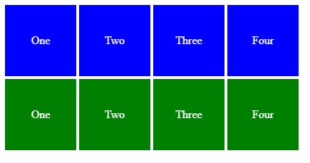
- Edit the codepen to get the two sections to look like the picture below.
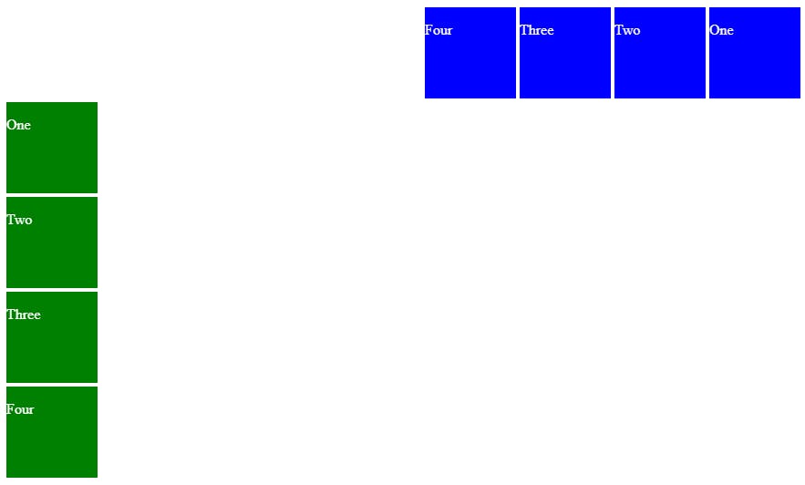
- Edit the codepen to center the words one two three and four in the
<div>s.
